|
|
Post by zenrat on Oct 25, 2013 1:56:53 GMT -5
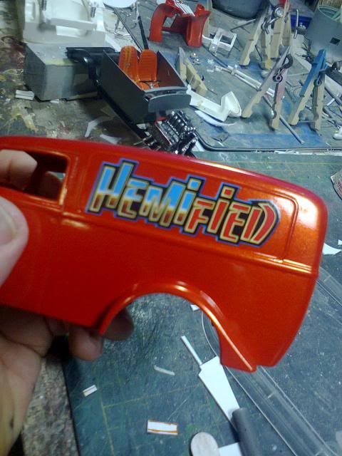
 The rest of the build is TRaKable but i'm not sure about these decals from the current release Revell '68 Charger. It's hard to tell with fonts and graphic design styles. |
|
Deleted
Deleted Member
Posts: 0
|
Post by Deleted on Oct 25, 2013 3:25:28 GMT -5
The '68 Dodge Charger had them, so you should be good to go.
|
|
|
|
Post by dodgefever on Oct 25, 2013 5:58:51 GMT -5
That lettering screams '80s to me, because of the "chrome effect" on Hemi, but see what the authorities say...
|
|
|
|
Post by cycolacfan on Oct 28, 2013 9:09:42 GMT -5
That lettering screams '80s to me, because of the "chrome effect" on Hemi, but see what the authorities say... Yeah, my thoughts exactly. The '68 Dodge Charger had them, so you should be good to go. But this wasn't an original 1968 issue, it's a kit released in the last 15 (?) years. I'm thinking 80's font too - got an urban graffiti spraycan feel to me. |
|
|
|
Post by ChrisV on Oct 28, 2013 11:34:32 GMT -5
The '68 Dodge Charger had them, so you should be good to go. But this wasn't an original 1968 issue, it's a kit released in the last 15 (?) years. I'm thinking 80's font too - got an urban graffiti spraycan feel to me. Revell's '68 Charger R/T (not the Dick Landy version)was issued within the last five years. Modern fonts are one of my pet peeves when it comes to nostalgic models - They can completely screw up the appearance of an otherwise neat old model. Dont by any means take it as criticism against your model, but IMO these decals are prototypical of Revell's half-assed modern day "pseudo-retro" kit and decal efforts: They seem very keen on taking on highly specific kit subjects only to follow 80% through...  |
|
|
|
Post by RodBurNeR on Oct 28, 2013 15:54:10 GMT -5
I feel the decals are very modern as well. The word or term? Wasn't even around until the last 20 yrs or so maybe. I don't have a problem with the word though, just how modern the decals look.
|
|